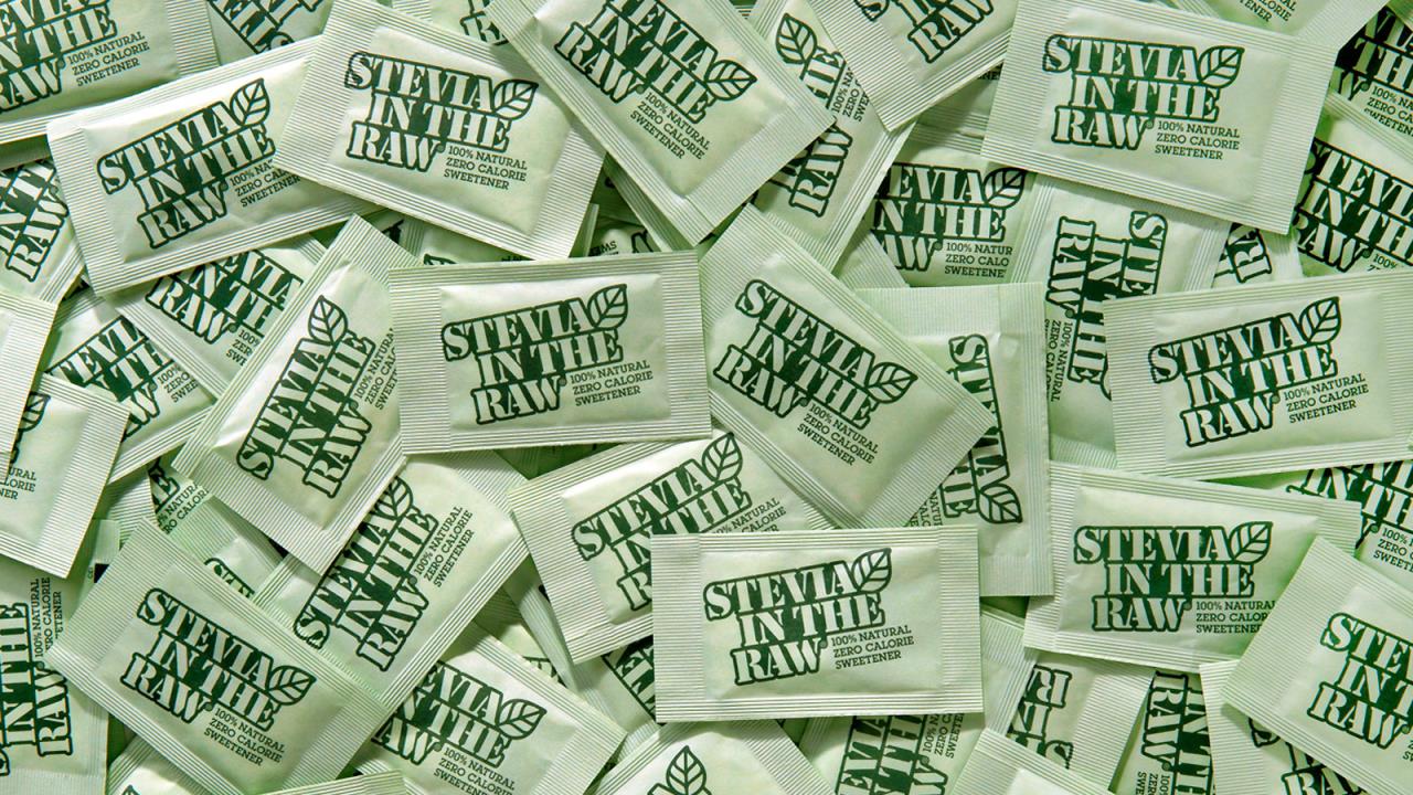
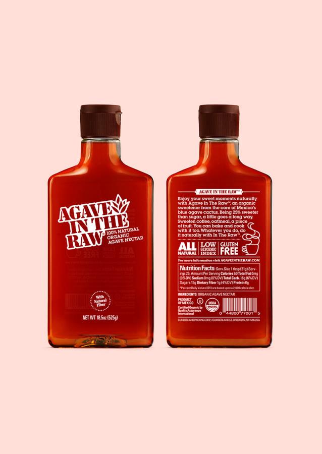
作为世界上最知名的甜味剂之一,The Raw在将其产品扩展到新的形状因子、产品和包装时,需要改进其外观。作为一个有着30年历史的品牌,其标志性起源于天然食品空间和咖啡馆,我们的核心挑战是让其努力工作的视觉标识感觉现代而广泛,完善当前的标识,同时为Stevia、Agave和Sugar in the Raw等子品牌、液体和糖浆创建一个系统。
探索一种必须发挥多种功能并出现在新地方的身份的局限性,一些小的调整开始改变甜味剂家族——拓宽自然调色板,提升品牌现有的字母形式,创造新的品牌形象——所有这些都有助于将in the Raw打造成最新的、对话式的。
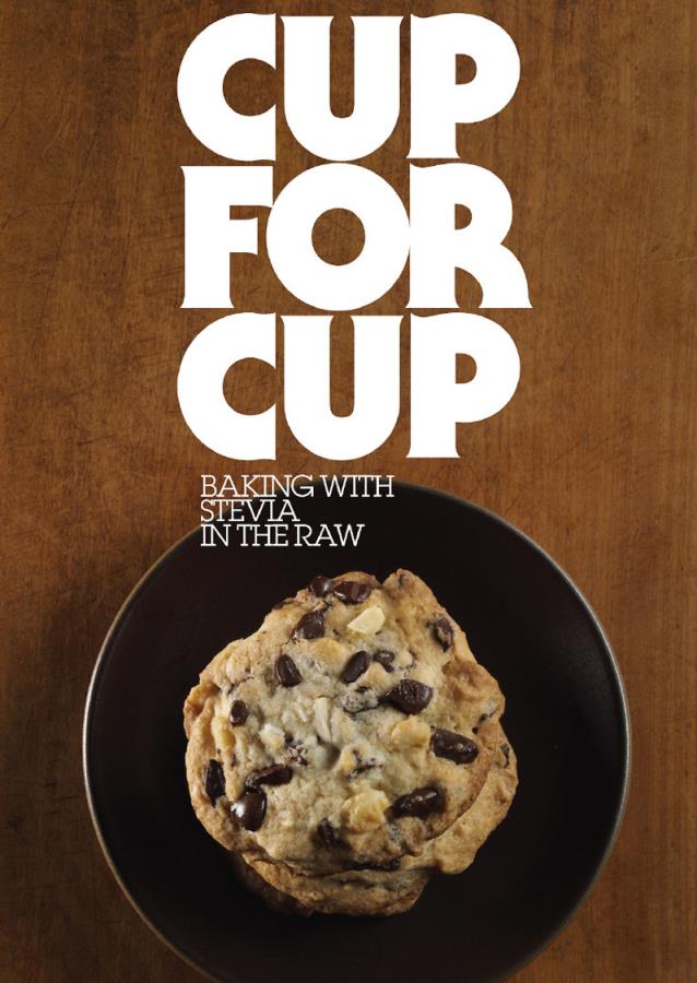
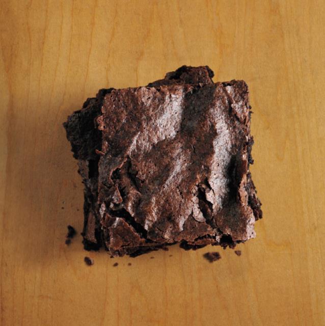
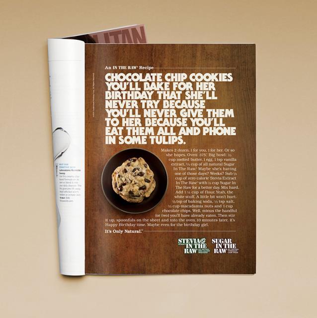
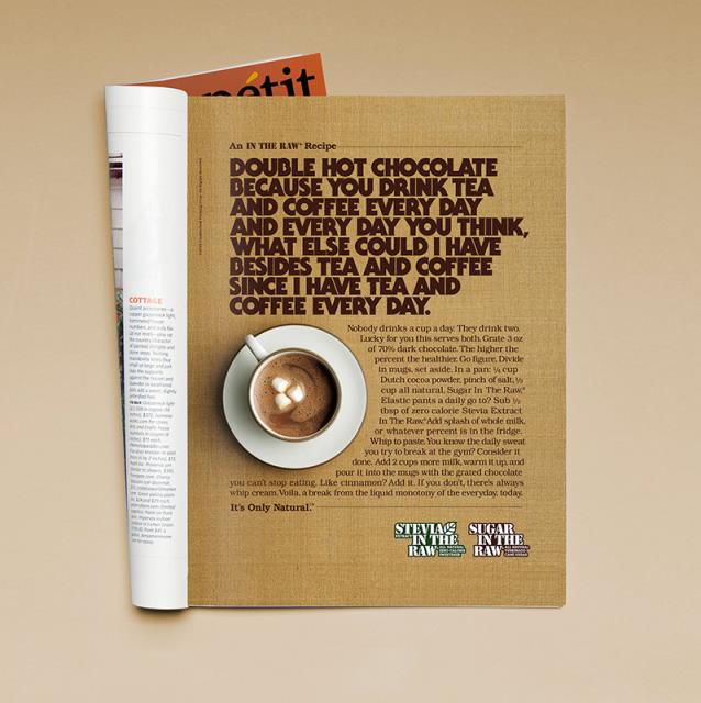
一项名为“这只是自然的”的探索人类真相以及食物如何在日常生活中发挥作用的运动,有助于向世界介绍其最新的身份和声音。